Friday, June 29, 2018

Current Obsession: H&M Home

I am not sure when and how it all started, but before I knew it, I already placed over a dozen online orders with H&M Home within a short four-month period. The in-store and online customer service wasn't the greatest or the most organized, but its modern and warm minimalism home collection with a touch of Scandinavian style (they are Swedish after all) kept me wanting to go back for more. It's quickly becoming a routine for me to check their online offerings almost on a weekly basis, and I rarely left empty-handed. 

Here are a few tips on shopping with the H&M Home online. 

1. If you spot something you like, buy it right away. They do go out of stock very quickly online. But if you miss it, don't panic. Just wait for a few weeks and chances they will come back in stock. This whimsical hand vase in the picture below constantly went out of stock within hours, but it does become available again from time to time. 

2. If modern and minimalism is your style, you've come to the right place. H&M Home collection often takes a classic decor staple such as vase with handles or milk jug, and give it a more modern interpretation and spin. 

I was so in love with this stoneware vase with handles that I had to have one each at home and cottage. Less prominent handles and half-dipped finish gives it a more modern life. Picture below: H&M half-dipped stoneware vase with handles at home. The textured stripped rug is also from H&M. 


The same vase at cottage


3. Check the "Sale" section diligently. It often "pleasantly" surprises you. I found the rattan tray (which I used as a wall decoration) and the Moroccan pom-pom pillow at 50% off, which I would've gladly paid full price for. 

The stripped stoneware vase and the square Moroccan pom-pom pillow were also scored at 50% off. 


The bamboo woven basket (on wall shelf) and the basket on floor are also from H&M Home. 

And the black candleholder in the picture below.  

So have you ever shopped at the H&M Home? What was your experience?


How to Prepare Your Home For a Move

~ This is a featured post. ~

Getting your home ready for a move is always a hectic time. There is a lot of organizing, planning, de-cluttering and logistics that goes into it. All of your belongings are packed up in boxes, so looking for something last minute is never a good idea! This is a time where you have to start using only your belongings that are out of the boxes. In order to reduce any stress and anxiety that may bubble up close to moving day, here are three tips to keep in mind when moving homes. Breathe in, breathe out, and remember that once you step foot in your new home, you can relax.

Organizational tips
Do not wait until move day to pack up your belonging and boxes! This is a sure fire way to become stressed. Instead, the best course of action is to organize everything and prepare what is needed ahead of time. The best way to approach this is to have a plan in mind. Take each room one by one and start packing everything in a box. Hopping from one room to the next while not finishing the previous one can make it seem like there is still a lot to do, so remember to take it step by step.

De-clutter the home
Not everything in your home is needed! In fact, chances are, there is a lot of clutter. As you are organizing and packing up your home for move day, keep in mind what you should give away, sell, recycle and trash. De-cluttering your home will also make the move experience easier. You do not need to take everything with you. There are probably some items that have been sitting in storage for years on end. Do yourself a favor and give those away. Getting into the habit of de-cluttering will come in very useful at the new house as well. It’s something that should be done year round and is thus a good habit to start getting into.

Logistical Planning
The last agenda item is to sort all of the necessary logistics and planning for move day. The closer you get to the move, the more hectic your life will momentarily become. It’s inevitable. You get the new house keys and all of a sudden – it’s go time. Once everything is packed up, it’s time to hire a moving company, such as Suddath moving company. You want to ensure you hire professionals to make the move a breeze for you, and your children. Your belongings all must safely arrive to your new home so you can start unpacking and putting everything together!

As hectic as moving may be, you can let out a sigh of relief when everything is packed up and ready to move into your brand new home. You can let out an even bigger sigh of relief when all of your belongings safely arrive at the new place, and you begin unboxing everything! Moving is a process, and it’s one that requires you to be organized and keep on top of your clutter and planning. Still, it’s also a great new chapter in your life that you can are starting! So don’t forget to celebrate once the move is complete.

Rental Property Renovation

~ This is a featured post. ~

Renovating a home with the idea of renting it out to earn an income is different to how you would renovate a home you would be living in yourself. Yes, you still want to make it nice for your tenants, but you don’t have to spend a small fortune on those luxury items you might like in your own home. If you are looking for ideas to do with renovating a home for the rental market, this guide shows you what’s important to include, and what you can save money on.

Finding a Property
Finding a property to rent out can sometimes be a challenge as you have to go through the steps of the buying process, and that can take time. There are companies out there such as Roofstock, that take the hassle out of buying rental properties. Once you have found the perfect rental property to buy, or already own one, then you can begin thinking about renovation.

Appeal to Tenants
Properties for the rental market should not be decorated to suit your personal taste. Whoever will be living there will want to put their own mark on it, so keep décor neutral. Neutral décor will help keep a space feeling bright, making it more appealing to people looking at properties to rent. However, that doesn’t mean you have to go for magnolia! A focus wall in a bold colour can add character to a property.

Another way to appeal to tenants is to spend most of your budget in the kitchen and bathroom. These are spaces where, if you can add a little wow factor, it will make tenants keener to live there. 

Durability
Some tenants are not always careful to properties like they would be if it were their own, so for fixtures and fittings, go for durability. Use tiling in bathrooms and utility rooms rather than paint, as it is easier for tenants to keep clean and means less redecorating for you between tenants. Good quality flooring will withstand wear and tear more than cheaper options, saving you money on the cost of replacing it. Also, quality faucets in kitchens and bathrooms will last a lifetime, compared with cheap alternatives. Doing your research can provide options for low cost renovations.

Keep Outside Space Neat
A low maintenance garden is something that will always look good, even if your tenant doesn’t spend much time caring for it. Putting a mulch in garden borders will keep the weeds from growing there, and having somewhere tidy to keep trash cans will add to the look of the property.

If you are thinking about renovating a house to rent out, remember to treat it like a house rather than a home. Remember, tenants are temporary and often treat a house as such. By going for quality over cheap fixes it saves you money in the long run, and a neutral colour tones will help tenants see themselves living in your accommodation.  By doing this, when tenants leave, you won’t have too much to do to get the house ready for the next tenants.

Monday, June 25, 2018

2018 Cottage House Tour Part I

I've received so many requests from my Instagram followers and blog readers to do a cottage house tour. So here you have it. I have a ton of photos to share, so I will break the tour into two or three parts so I don't overwhelm you with all the pictures. This post covers the porch, foyer, living room and dining room. 

Picture below: our cottage covered porch. Scandi-styled patio conversation set was from JYSK (no longer available), 8x10 blue outdoor rug from Lowes, dining table from Wayfair and bistro chairs from Amazon. It's funny (and silly) I picked our cottage lot based on the sliding colour. This cheerful yellow really makes me happy. It provides a perfect backdrop for the modern, minimalist and Nordic theme I am going for. 

This is the porch from the other perspective. 

I couldn't be happier with the Hindo patio storage shelf unit from Ikea. Not only doesn't it provide some height for visual interest, it also packs a ton of storage. Behind those closed doors are our life jackets, a trac-ball set, and a badminton set among other things. The shelves avail me surface space for entertaining - not to say I could also style them pretty!  


Our cottage is in the woods. Trees with sky-high canopies offer stunning views as is, so we tried to keep the landscaping to a minimum. The immediate surrounding area however did get pretty muddy when it rained so putting down a walkway was essential. I opted for a complete wraparound walkway for easy access from either side, and a more symmetrical appeal. The contrast between the darker slate centre and the lighter-grey paver border was amazing. The entire landscaping was done for us during the week. Nothing beats arriving at the cottage on a Friday afternoon to find your design plan was implemented to a T, and the workmanship was impeccable. 

We are going to have three Lilacs planted on the right side to the walkway. That way I can see them from our kitchen window. I would also change that patio light to something a bit more interesting and maybe in a matte black finish. 

Going back inside the porch, remember last year I painted our front door in BM's Raccoon Fur. So glad I did!  

It's a perfect shade of char-navy. The Schlage Addison lockset in matte black which was kindly provided to me by Allegion on behalf of Schlage, instantaneously elevates the style. Together they are quiet, simplistic yet incredibly sophisticated, just what I was after for our cottage. 

Immediately behind the front door is probably the world's smallest foyer. I managed to install a peg rail and squeeze in a short bench for extra storage. 

The dining room presents itself as soon as you set foot into our cottage. 

Two weeks ago I came across this handmade butternut canoe paddle while we were out in the county antiquing. I've always wanted to invest in a walnut paddle but couldn't bring myself to like those heavily varnished ones from big box stores. This one was finished with mineral oil so the wood texture was subtly preserved. 


Our living room, dining room and kitchen is all one big open space. Furnishing, styling, giving each room its own definition and all while making one naturally flow into another, is no easy feat. Our counter stools constantly fight for space with this ginormous sofa right behind them. 

After trying out a Moroccan shag and a vintage-styled Turkish rug, I finally settled on this gorgeous cowhide number to anchor our living room. I am positive it's here to stay. 

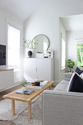
I had an a-ha moment while watching TV the other night while staring at the ugly make-do TV stand I managed to squeeze in between two windows. It was an awkward, confined (to in between two windows) but also the only logical spot for a TV. I thought, how about a floating TV stand like the fauxdenza in my home basement? Though the floating cabinet takes up the same amount of wall space, the overall room appears so much more spacious because the cabinet is lifted off the ground. Not to say I am still crazy about the "fauxdenza" look and the outcome was completely satisfying. By hanging the TV on the wall, we also gained that extra foot in distance between the TV and the sofa. I honestly can not think of any downside of a floating cabinet! 

I called in my local contractor Super Ian to bring my design plan to life. It was perfection. 

Part two of the tour will be about kitchen, bedrooms and the most exciting loft! Stay tuned! Let me know what you think of the cottage tour so far. 


8 Ways For Creating a Modern Home Style

~ This is a featured post. ~

If you want to change the way your home looks and you don’t want to move, then why not look at your interior design scheme and change that instead? Moving house is costly and disruptive, but renovating and redecorating is much easier to cope with and a lot cheaper. It makes sense that if you want your home to look different, but you enjoy being where you are, then you should look into ways of changing what you already have. Here are some ways to make your home look more modern.

Use Bold Colors
If you want your home to have a truly modern look, you will need to paint over the pale and neutral colors (some of them at least) and make it much brighter and bolder. You should not change all of the walls because that could make your home uncomfortable; either too bright or too dark. However, by adding a splash of color here and there with a statement wall, or bright blinds or drapes, colorful furniture, or even brightly colored art on the walls, you can make your home look a lot more modern than it ever did before.

Change Your Furniture
If you’ve had the same furniture for years, maybe even decades, then changing it can give your home an entirely new look. Take a look around and get some inspiration about what is modern and what isn’t and then you can start designing your new interior. There are stores such as Room Service 360 that specialize in the most modern and up to date furniture, so if you are looking for something that will definitely make your home look incredible, this is the place to head for. Make sure you speak to the store employees about the size and shape of the room you want to add the furniture to as they will be able to advise what is going to work out best.

Add Plants
Plants are a great way to make your home look not only up to date but also loved and lived in. It can make it seem (and be) a lot more comfortable, and there is no chance of your home coming across as lifeless and clinical if you have greenery in it, or beautiful blooms if you prefer vibrant colors and not just the green leaves of a houseplant.

Plants are good because they don’t cost a lot if you shop around and find something that works for your budget, and many of them don’t need a huge amount of looking after other than positioning them in the right spot and watering them when they need it. They are even beneficial to health. You can buy large plants to have on the floor or smaller ones that can work well on tables, bookshelves, or window ledges.

Look At Your Lamps
Having a less-than-modern lamp in your room can affect the entire look, even if everything else is up to date. In fact, if it is the only older item, it can reduce the impact of everything else you’ve been doing. You need to have a modern lamp to finish the room off perfectly, so search out something that is simple and elegant. Geometric shapes made of glass or metal are excellent choices, for example. If your budget doesn't stretch to a new lamp, you can upcycle the one you already have with paint or a new shade to make it look stunning.

De-Clutter
A clear, clean space will instantly make your home look more modern. If there are lots of items on every surface, guests will potentially feel uncomfortable when they are in your home because people do tend to want a bit more room to move around in than a cluttered home can give them. Clean lines and open spaces are what make a home look truly modern, so you may want to invest in furniture that offers you the option of additional storage. Alternatively, you could have a clear out and give items to Goodwill or sell them at a garage sale.

Add Rugs
Rugs are a nice touch because they can be changed as often as you like, unlike carpeting. Having a modern wooden floor or tiles and then a gorgeous rug over the top can bring an entire room together. Find a rug that matches well with your furniture otherwise; it will look out of place. When you are choosing your rug, and you want it to be modern then picking a shag rug will be best. It should either be one plain color, although ideally, this color should be nice and bright or covered in geometric shapes. Take your time selecting the rug that works best for you and your home, and perhaps buy two or three so that you can change them when you feel like it, or move them from room to room. Don’t worry if you already have carpet; rugs can happily sit on top, but make sure they don’t clash.

Floating Staircase
Although including an open staircase into your home will be more expensive and take more time, not to mention the potential disruption it could cause than the other items on the list, but it may also be exactly the thing you are looking for. An open staircase, properly done, not only opens up the entire room and makes it look more comfortable and inviting, but it can also be a work of art in itself, making that room look amazing. The difference between an open or floating staircase and a closed one could be the only thing that is stopping your home from looking modern, so you might find that speaking to an expert architect or designer who can assist will change everything for you in a hugely positive way.

Update Your Kitchen
Your kitchen is an important room and is perhaps the most important room of all. If your kitchen is old fashioned, then it can let the rest of your home down. You don’t have to spend a fortune on updating your kitchen if you don’t want to; you could simply paint over older cabinets with special paint, and the entire look can change instantly and for the better.

Thursday, June 21, 2018

Creative Use of Your Garage Space

~ This is a featured post. ~

Garages tend to be one of those things that have tons of items and half of the time you may not know what’s inside. If caution isn’t taken, it can quickly turn into a junkyard that becomes near impossible to declutter. There are more ways than you can imagine which you could use your garage space as opposed to a house for random items. Some of these ideas could even increase the value of your home if done properly. To inspire you as well as give you some ideas, you’re going to find three ways that you can use your garage space below.
Image source: Pinterest

For Your Cars  
This is probably the most obvious use, but your garage can be used to park any cars that you may have at home. Beyond this, however, it can be transformed into a mini-workshop if you’re a car lover and want to learn more about maintaining or even personalizing your car. The good thing about garages is that if they’re spacious enough, you can sometimes house two cars. In case you were thinking about purchasing a second car, consider a smaller car such as a Mini to ensure you still have enough space. Therefore, you should consider searching used Mini Edinburgh to find a beautiful, reliable second car. Beyond a boring garage, you can transform yours into a personalized home for your cars by including auto-themed interior, stocking car essentials, as well as any tools you may need for DIY jobs. You could also throw some speakers in there so you can listen to music while playing with your cars.  

Bedroom
Another interesting use of a garage is as a bedroom space, and this is also something that could potentially add value to your home as it increases the number of habitable rooms you have available. Some things that you could do to transform your garage space into a bedroom include giving it a fresh coat of paint, exterminating any pests, and then furnishing according to your taste and budget. You should also think about ventilation, which means if you don’t have any windows, consider creating a few. If you happen to live in a warmer climate, this is imperative, so you have a free flow of air. If not, you may find it gets very stuffy inside making it uncomfortable for living.

Home Gym
For all of the fitness fans, you’ll probably love the idea of turning your garage into a gym. There should be more than enough space available for you to put your equipment as well as for you to stretch and do other fitness activities. Some equipment to consider buying for your home gym include adjustable dumbbells, a treadmill, mini resistant bands, a yoga mat, weighted jump rope, foam roller, and weight plates. It’s a great way to save money on a gym membership as you can create your gym in-house.
How you use your garage space is largely dependent on your needs. You may need more storage space, a spare room for a certain purpose, or simply need somewhere to park your cars safely. Whatever the case, remember that your garage is an empty space, which you can use for both conventional and unconventional things. By doing so, you’re likely to put your space to better use.

Why Use a Handheld Vacuum


I am a big fan of handheld vacuum, so much so I keep one in each high-traffic area. I don't know about you, but this girl sheds like a golden retriever every time I blow-dry my hair. I could probably knit a sweater out of my hair at the end of the week if I didn't vacuum them up right away. 

You all surely are familiar with the operation of a vacuum cleaner. These powerful machines can help in cleaning the debris present on various surfaces and ease the workload for users. However, some of them have been known for their bulkiness, which makes it harder to move them around. This lack of mobility in some models has restricted their full potential, but not anymore. Using a handheld vacuum cleaner enables users to overcome the issue of bulkiness. Perhaps you are thinking of why you would go for a machine that is less powerful for your chores. Thus, this post will share some advantages to help you understand the importance of a handheld vacuuming machine.

Compact Size
Several vacuum cleaners are known for their powerful suctions. However, with a powerful motor, the bulkiness and size also increases. This makes it harder to use such units. Thus, a handheld vacuum cleaner does the job here through its small size. Some of these even fit a user’s pocket. Thus, storing them after usage is not a problem. A compact-sized machine enables you to reach out all places in your house or any other location that you want to clean. You will not have to worry about carrying them around as well. Their compact size also gives you the freedom of using them for cars, closets, and other small spaces that are harder to reach with a bigger vacuuming machine.

Ergonomic Design
You can benefit with the ergonomic design of these equipment. Handheld vacuum cleaners offer you the freedom of using the machine without any complicated mechanism. Being lightweight, you barely notice them in your hands. Even kids can use these devices freely. You can even ask you child to use it for the study table, etc., and kids may enjoy using these on their own.

Portability
Besides their conservative size and a lightweight body, they all have a handle that is not difficult to hold your grasp on while tidying up a wreck. You may get a varying handle for your purchased model to show. Despite that, you get a simple and portable device to carry around anywhere you like.  Also, numerous handheld machines are cordless, making them considerably less demanding for you to bear. You can choose a cordless vacuum cleaner to ensure that your cleaning work is unhindered. However, if you pick a cord model, go for the one that comes with a long cord so that it is easier for you to use it in various places. You may also like to read about Dyson Weight Comparison.

Obviously, a cordless handheld vacuum comes with its own arrangement of advantages and disadvantages. Indeed, they are anything but difficult to utilize and bear, yet in the event that you neglected to charge the battery then you may not land the cleaning position finished without recharging it.

Your handheld vacuuming device is an innovative appliance that will remove all restrictions for you while you use it. Remember to research carefully before choosing an appropriate model.

Friday, June 15, 2018

Ideas for an Attractive and Classy Living Room

~ This is a featured post. ~

The living room is one of the most important rooms in the house in terms of the overall appearance of your house. This is because the guests and all other people who enter you house will first have a look at your living room. Thus, it is extremely important that the living room is well organized at all the times and it is the living room only that reflects your aesthetic and personal taste. The living room creates the first impression on the people who enter the house and as the time-tested proverb goes, first impression is the best impression. This is why you need to make sure that your living room is maintained in such a manner that it provides the best impression to the visitors. You can make use of the following ideas to make your living room more attractive.


Hanging a big piece of art
You should try to do something unique which catches the attention of anyone who enters your house. Given this, hanging a very big piece of art on the walls of your living room would be the perfect option. This will certainly catch the attention of anyone who enters the living room. Moreover, hanging an art piece will not only make your living room look very elegant but would also create a very good impression on the visitors who come. You can readily find a number of these types of decorative pieces of art and most importantly, many of these come at pocket friendly prices so that this idea does not put a lot of pressure on your pocket.   

Styling should be smart yet simple
It would be a very good idea to keep the overall styling of your living room very simple but at the same time it should be smart enough. It is to be made a point that the living room is not cluttered and over accessorized because this makes the living room appear to be messy. Now, for the purpose of making the living room appear elegant and sophisticated you need to choose something that is stylish and attractive but simple. You should remember that a simplified space would allow the elements that are present to shine at their best.

Decorating with show pieces
Show pieces are always considered to be extremely attractive additions. Decorating your living room with show pieces would surely make it quite elegant and attractive. It would be worth mentioning that items like the Obsidian knife would be the most unique options available in this regard. It adds up to the overall look of the living room. These knives are very attractive to look at and are not too costly as well.

Sculptural items can be incorporated
It would be a great idea to incorporate a sculptural item in the living room which enhances the beauty of the living room and at the same time creates an artistic impression on the visitors. A nice sculpture is a great representative of the aesthetic taste of the homeowner.
The implementation of these ideas can help you decorate your living room at its best. So, go ahead and make your living room more classy and attractive!  

Monday, June 11, 2018

Summer Fun and #ThisIsMyBrita

Summer quickly descended into The Six. For us, we wasted no time to retreat to our Nordic style cottage in the Prince Edward County. With reno projects coming to an end, I could now spend more time styling and we also get to plan all the exciting fun activities with family and friends. It's going to be an epic cottage season this year. 

Picture below: our cottage lakeview at sunset

Good food and wine is always part of our definition of fun. We enjoy those impromptu pasta dinners al fresco, play a trac ball game, or simply lounge and read a book in our covered porch. Summer dinner get-togethers are our favs. So I was very excited when Angie from Devon Consulting asked me to join the #ThisIsMyBrita campaign to personalize my Brita pitcher. I couldn't live without Brita, especially in the cottage country where water is a lot harder and chlorine smell a lot stronger. Brita pitcher always comes handy when we host friends and family. It's the first thing I reached out to in the fridge whenever I felt the need to be hydrated. 

For the #ThisIsMyBrita program, I was given a Brita pitcher and a permanent marker to add personal styles and touches to the pitcher. Cottage and nature-related themes immediately came to mind. As I walked by the Alanna Cavanagh's Blue Bell print I recently acquired and now hung in my foyer, the light bulb went off in my head. So here's my personalized Brita pitcher inspired by my favourite illustration artist Alanna Cavanagh. The sun in the upper right corner is a little homage to summer and cottage season.  

I then coloured all the Bluebell flowers with the purple marker that came with the package. I was so happy with the outcome that I wanted to draw another one on my other black Brita pitcher. 

So how do you like my personalized Brita pitcher? Do you use Brita pitcher at home? Do you use it more during summer months? Do share! 

Tuesday, June 5, 2018

Portugal in One Week

We were looking for a warmer spot to visit for one week in early Spring, and Portugal seemed to have fit the bill. Most of the cities along the southwest coast are generally a day trip away from Lisbon, so that made planning our trip a lot easier. If you've been following my travelogue, you'd know I hate to pack and unpack on a daily basis. Therefore, to be able to come back to the same hotel at the end of the day was everything to me. 

Picture below: a still moment captured by my camera in the bustling Alfama district. 

We spent six days in Portugal. Our itinerary went like this:

  • Day 1: arrival the night before. Our hotel was in Baixa (downtown). The next morning started with Museu Nacional do Azulejo, then worked our way through Church of Sao Vicente of Flora, Castelo de St. Jorge to the heart of the Alfama District. 
  • Day 2: Sintra and Cascais.
  • Day 3: Nazare and Obidos.
  • Day 4: Explore the Bairro Alto area in Lisbon.
  • Day 5: Art gallery (Calouste Gulbenkian Museum), shopping.
  • Day 6: Back to Alfama district, shopping.
  • Day 7: Departure. 

Weather

According to friends with family in Portugal, this was one of the most miserable springs they've ever had. It was cold and rainy with overcast every day. The weather really surprised us when we arrived. Except for one quick shower when we were in Nazare, the weather held up. It was sunny with blue skies and warm for all the seven days we were there. The sky couldn't be clearer even when we were up in the Pena Palace. According to locals, up in the mountains, it's almost foggy at all times especially in the morning. Looks like Portugal really liked us. 

Picture below: the Pena Palace from the Queen's Throne vantage point

Sintra old town: this was our view from the steps to Palácio Nacional de Sintra. We had lunch al fresco there and had the best time people watching. 


Coasts and Waves

Portugal has stunning coastlines and wave watching was my absolute favourite part from the trip. The colour of the ocean hasn't quite turned turquoise yet as those postcard pictures of Algarve, but the monster waves more than enough made up for it. 

Picture below: Cabo da Roca, the westernmost point of continental Europe. 


Picture below: the quaint and picturesque fishing village Nazare and its famous crashing waves


Art

We only had time for one gallery so Calouste Gulbenkian Museum was the natural choice. We went straight to the modern art section. 


Serendipity

It takes a bit of luck when it comes to travel experience: weather, hotel, food, people encountered, places living up to expectations. Strangely enough, because I was so consumed by work before our Portugal trip, I didn't have time to do much research or planning. All I wanted was a warmer place to visit so I packed no expectations whatsoever. Yet the trip turned out to be one of the most interesting ones we've ever had. 

Picture below: Obidos, a medieval town trapped in a time capsule. 

Our first instinct was to hike up to the walls as they avail the best views. Unlike the old town of Dubrovnik, the inside of the walls facing the town in Obidos were completely open with no railings. We really put our parkour skills to test. 

We stumbled upon the Jardim Botanico Tropical in Belem on our way to lunch. It was so hot that day that we had to take a break in the shade. A group of people were patiently waiting for this peacock to fan out so they could take pictures. As soon as we approached, Mr. Peacock completely fanned out and followed me around. He even turned around a few times just so I could take pictures of him from different perspectives! If this was not serendipity I don't know what is! 

Picture below: the nerdy me next to Mr Peacock. I am 5'4" so you can tell how tall his feathers are. 

Saudade

There isn't a perfect translation for the Portuguese word "Saudade". It loosely means a feeling of longing, melancholy, or nostalgia. And that's exactly how I wanted to feel at the end of our trip. Tell me, have you been to Portugal and how was your experience? 


Related Posts Plugin for WordPress, Blogger...