Tuesday, September 30, 2014

Drone, Cornfield and BBQ Party

Sorry to disappoint, but there was no alien involved. We made good use of the gorgeous weather we had this past weekend by having a backyard BBQ at my friend Jack's house. 

The first picture was taken using DJI Phantom 2 Vision+ drone with camera - aerial photography is something I could really become obsessed with. 

The water was just warm enough for all the kids to take a dip. 

Forget about Weber or Napoleon, a simple grill rack over stacked bricks using maple wood from Jack's backyard produced the best-tasting BBQ meats. 

The yard backs onto a cornfield - how fantastic is that? 


Lastly, a picture of me with one of my friends' son Evan. Are you into plaid this fall? 


Saturday, September 27, 2014

Les Touches Pillow and Stuck on Hue Etsy

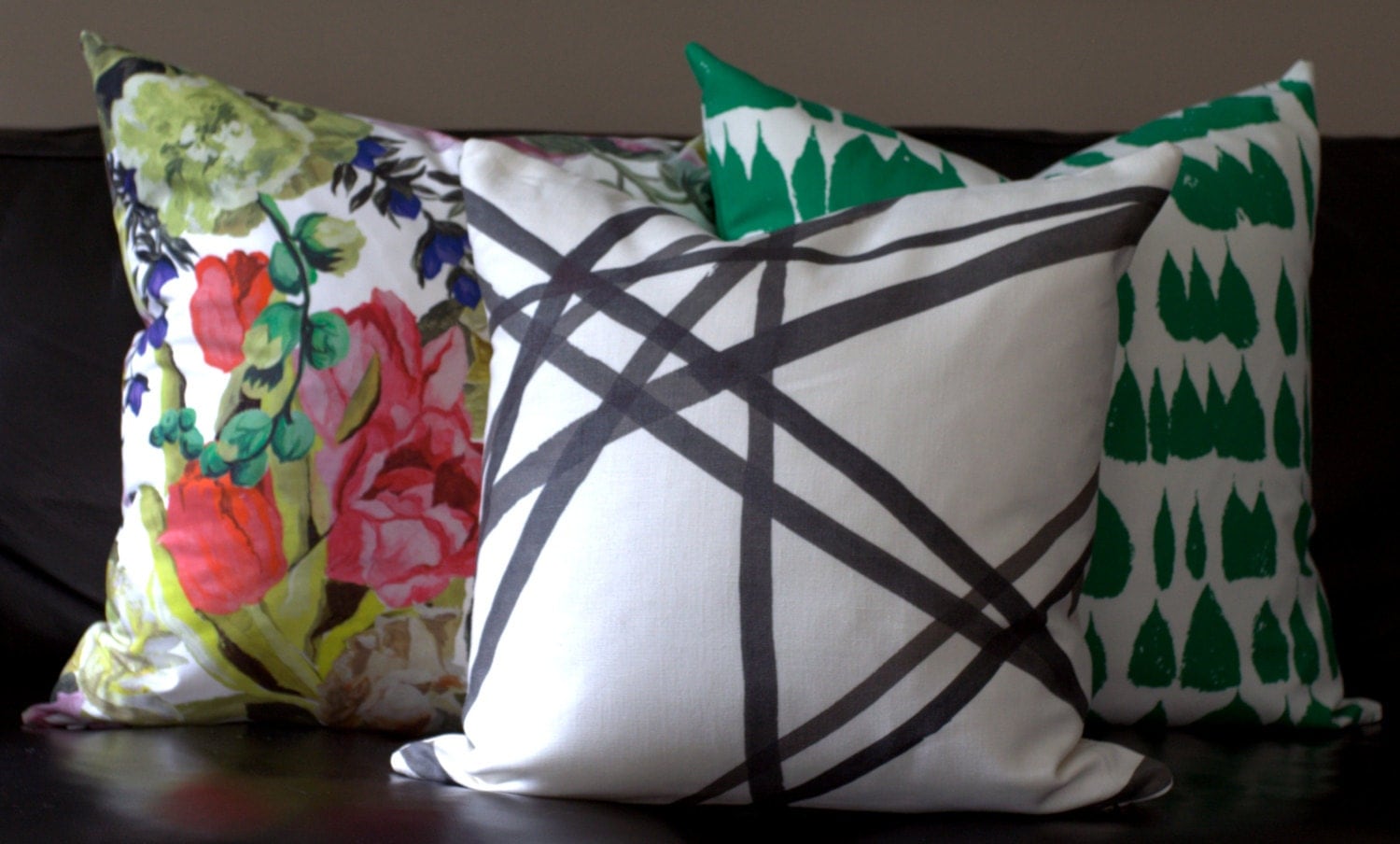
I am still obsessed with animal prints, and all those stripy and spotty fall fashion outfits didn't help. They constantly reminded me of just how much I love Brugweg & Fils' Les Touches fabric. I know I sounded like a broken record - I said I wasn't going to fork out that much money for a pillow; but I also know that Les Touches Black and White would look amazing in any room of my house, so I couldn't let it go. 

I exchanged emails with Hollie of Stuck on Hue on Etsy on and off a few times over the past couple of months, mostly because I couldn't decide whether to bite the bullet. Hollie was extremely helpful and patient, and worked with me to pick out a section of the fabric that would show a symmetrical yet organic pattern. I finally decided to go through with it, and I ended up ordering not just one, but two of them! 

I have to say this is by far my favourite pillow/fabric in my house right now - the Brugweg & Fils' Les Touches in Black and White. 

Gorgeous, right?


The other one is now on my foyer sette. 

Hollie has tons of other gorgeous pillows in her Etsy store, all handmade by herself with superb sewing workmanship. Her choice of fabrics is on trend yet timeless. I am already eyeing this Kelly Wearstler's Channels in Ebony & Ivory.

It would also look great as a long body or lumbar pillow like this. 

Hollie's pillows are widely used in interior designers' homes and projects. Like this 20-inch leopard velvet pillow in designer Sherry Hart's dining room. 

And the banana leaves pillow covers paired with a black and white striped headboard by Sara Lorton Designs. 

And there are so many more in her Etsy store. 

Hollie is also the talented DIY blogger behind I'm Busy Procrastinating. Check out this amazing DIY Black & White abstract art she painted for her living room. 

And the ceiling medallions as statement wall art, how creative! 

Hollie is on vacation until early October so her Etsy store is temporarily closed. Be sure to check back for all the fabulous designer pillow covers she offers at likely the best prices you can find anywhere online. 


Friday, September 19, 2014

Fall Porch

September has been so busy that I haven't been in town much, or had the time to do one of my favourite things - blogging. 

I picked up a few of these wicker planters from Home Depot during the fall clearance sale, and I like how they look with yellow fall mums on my front porch. It kills me a little every time I lay my eyes on those steps. The concrete steps were there when the house was built. I didn't have our landscaping contractor yank them out because I didn't want to cause any structural damage to the porch. Plus at the time we were having both front and back yards hardscaped at the same time, so in the midst of chaos I had decided to leave the steps alone. And I regretted it ever since. 

There is a paver-stacked platform at the end of the steps, see below. I don't want to touch what's already there, so my only option might be the stamped/patterned concrete. Do you have any experience with stamped concrete landscaping? How do you like it? I think I am going to replace those railings too with wrought iron or black aluminum ones. By the way, I also hired a landscaping company to clean up our front yard: we downsized the four Rose of Sharon trees to two because they were growing out of control; we also gave away a few shrubs to our neighbours so our front yard would look clean and uncluttered, just the way I like it. 

Lastly, Ikea is having a 20% mirror sale until Sept 21. I picked up the Stave mirror and hung it on the wall behind our bedroom door. I like the mirror long and narrow so it doesn't take up much room yet it still allows me to check on my outfits before heading out. I think Miffy likes it too. 

Have a great weekend everyone! 


Monday, September 1, 2014

New Art and Ikea Stromby Hack

I have been obsessed with Jessica Rae Sommer's portrait art for a while. They are expressive, avant-garde, and capture the most vivid colours and details of a moment. I can't really put a label on my decorating style (that's probably why we call it eclectic), but it is on the transitional side and is definitely not mid-century mod. Therefore I am a bit concerned that her artworks may not work for my home, but I couldn't seem to be able to take them off my mind either. So I finally decided to give them a try, and ordered two of my favourite ones: Lavender Heat and Face (for NYC). I am glad to report that I am beyond happy with how they turned out. 

This is Jessica Rae Sommer's Lavender Heat in an Ikea Stromby Frame. 

I really want a thin and minimalist frame so I opted not to go with Ribba which has a much deeper profile. 

I was all ready to get to work and spray this baby with a few coats of gold paint until I found out that the glass of the Stromby frame is glued to the frame and does not come off. So frustrating! I ended up having to go the old fashion way by taping up the glass and painting it in Liquid Leaf Classic Gold. You can still see brush strokes when you are up close, but overall the gold-leafed frame looks fine if you are not looking for them. 

The framed Lavender Heat is now in my master bedroom. 

Now onto the Face (for NYC). I have seen many designers and bloggers incorporate this painting into their projects and they all look gorgeous, like what Sara Blakely did in her mid-century mod dining room. 

Initially I was going to have it custom framed in the same minimalist black frame, or have it laminated and mounted onto a poster board. As I was contemplating the options, I taped the print onto an existing framed art in my upper hallway to see how it would look with the gold bombe chest. I was pleasantly surprised by how amazing the print looks in a thicker champagne picture frame! I immediately took out the black white photo and replaced it with the JRS' print. 

Under a different lighting.


I think I like this setting better with black and white accessories. Who knew such a piece of avant-garde portrait art would work so nicely with a more traditional style hallway of mine? The conclusion is that there are no rules when it comes to art. Just collect whatever your heart tells you to and display them all. 

P.S. I bought both prints from Society6. 


Related Posts Plugin for WordPress, Blogger...